
The 2024-25 NBA season is here. As we kick off the new campaign, we’ve divided all 30 City Edition jerseys into tiers. See where yours landed below.
S-Tier (Super, The Best)
Milwaukee Bucks
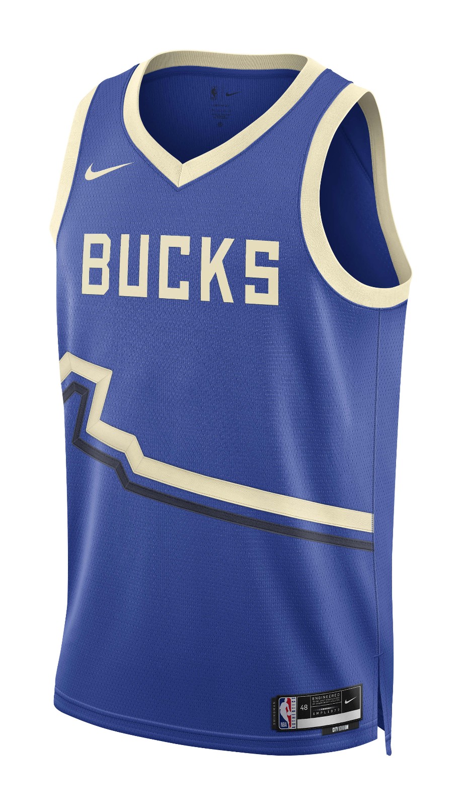
Yes to it all. The colors, the font, the stripe. It all works. Great way to bounce back from their disaster of a City Edition jersey last year.
Orlando Magic
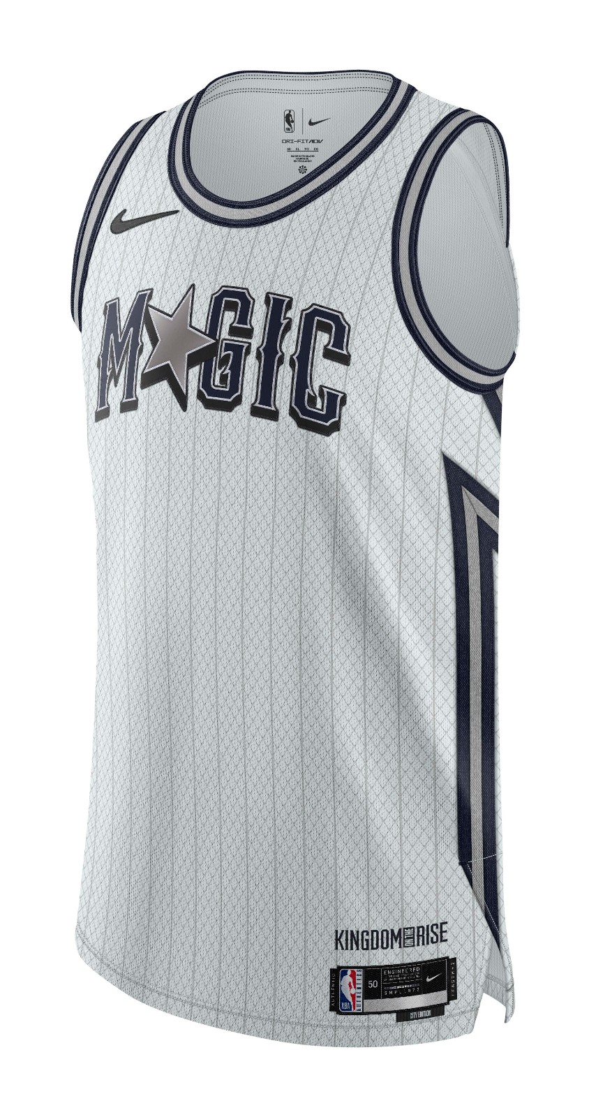
These are killer. Tasteful pinstripes with a font that pops. Perfect use of the star. Creative without being in your face about it. Love all the small details. There are no mistakes on this one. Bravo, Orlando.
Sacramento Kings
Normally I would urge the Kings to stick with purple, but WOW these are nice. Very sharp look. Instantly the best in their wardrobe. Hope to see these a lot this season.
Toronto Raptors
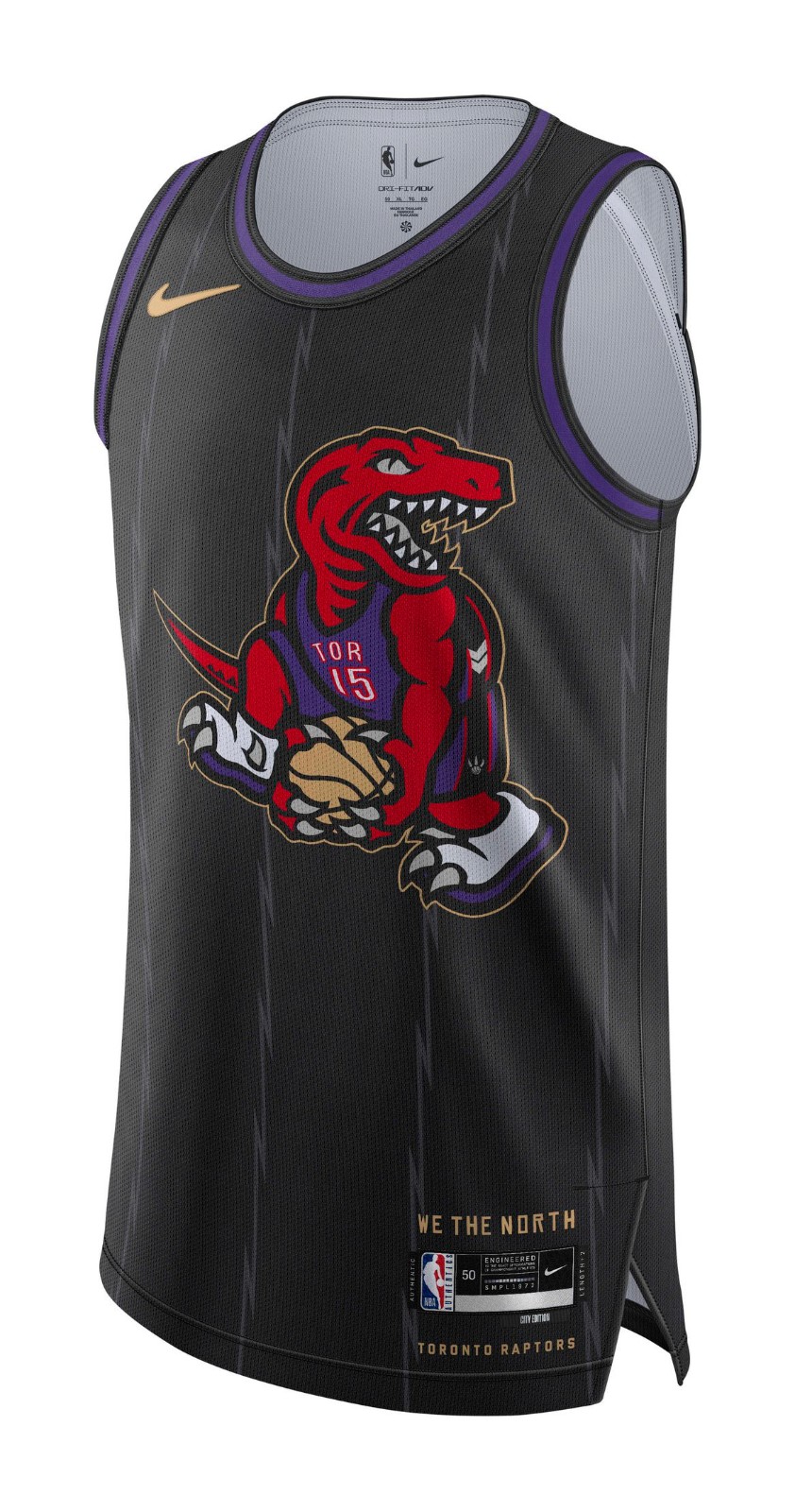
Special jersey with a special ode to the great Vince Carter. Way to play the hits.
Utah Jazz
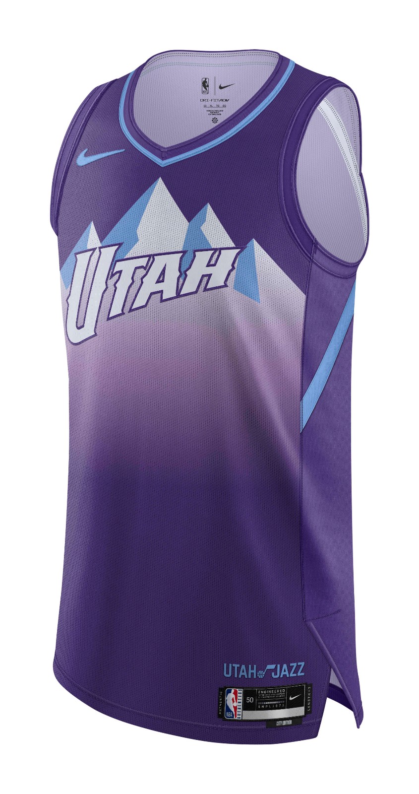
The jersey speaks for itself. When you have a timeless classic, you wear it. Take notes, Nuggets.
A-Tier
Atlanta Hawks
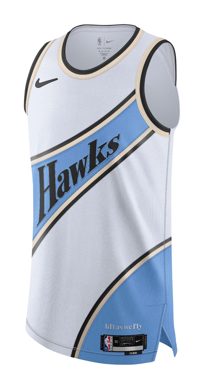
Clean and creative. Nothing bad to say about this design. Gold accent really works with the baby blue stripe.
Dallas Mavericks
Everything that the Bulls jersey wants to be and more. Simple and elegant. Think these will look great on the court.
Detroit Pistons
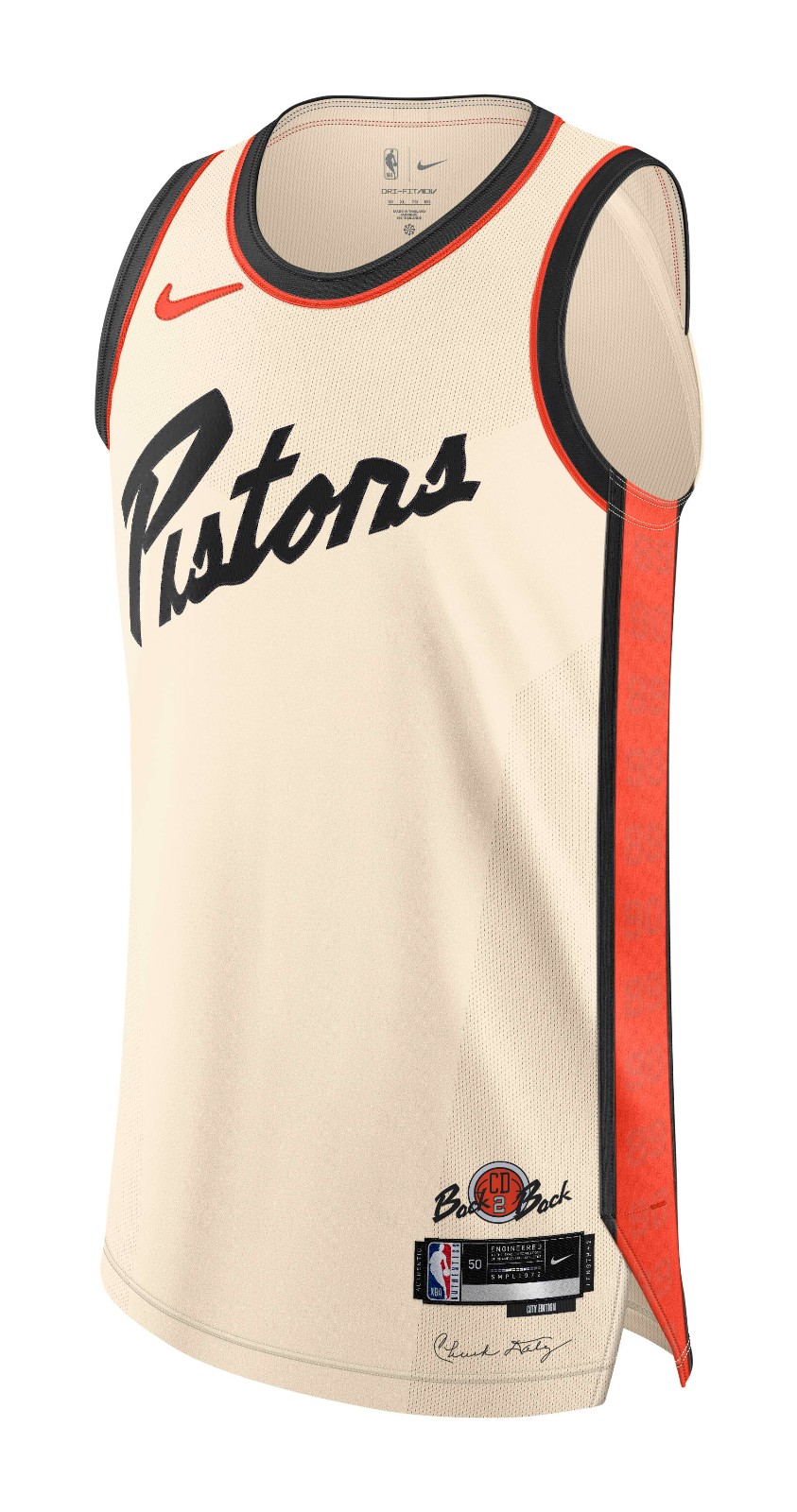
Great, unique color combination. The lettering pops. Great font too. Not sure where this obsession with diagonal lettering came from, but it works here.
Houston Rockets
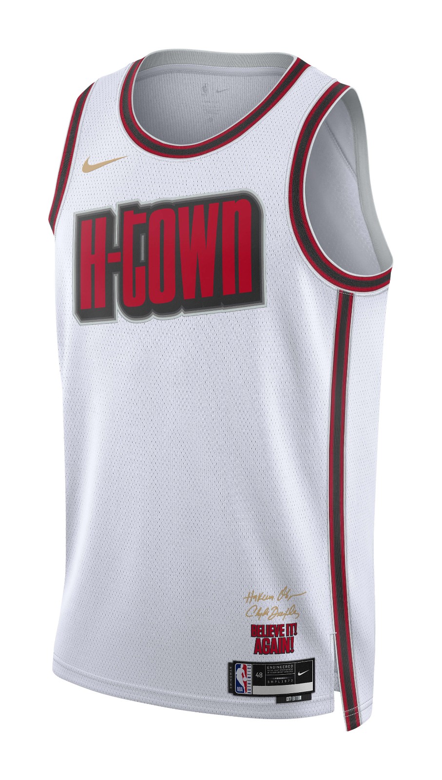
Beautiful, beautiful stuff. Red on white with fantastic black accents. The only thing keeping it from S-Tier is this “H-Town” nonsense.
New Orleans Pelicans
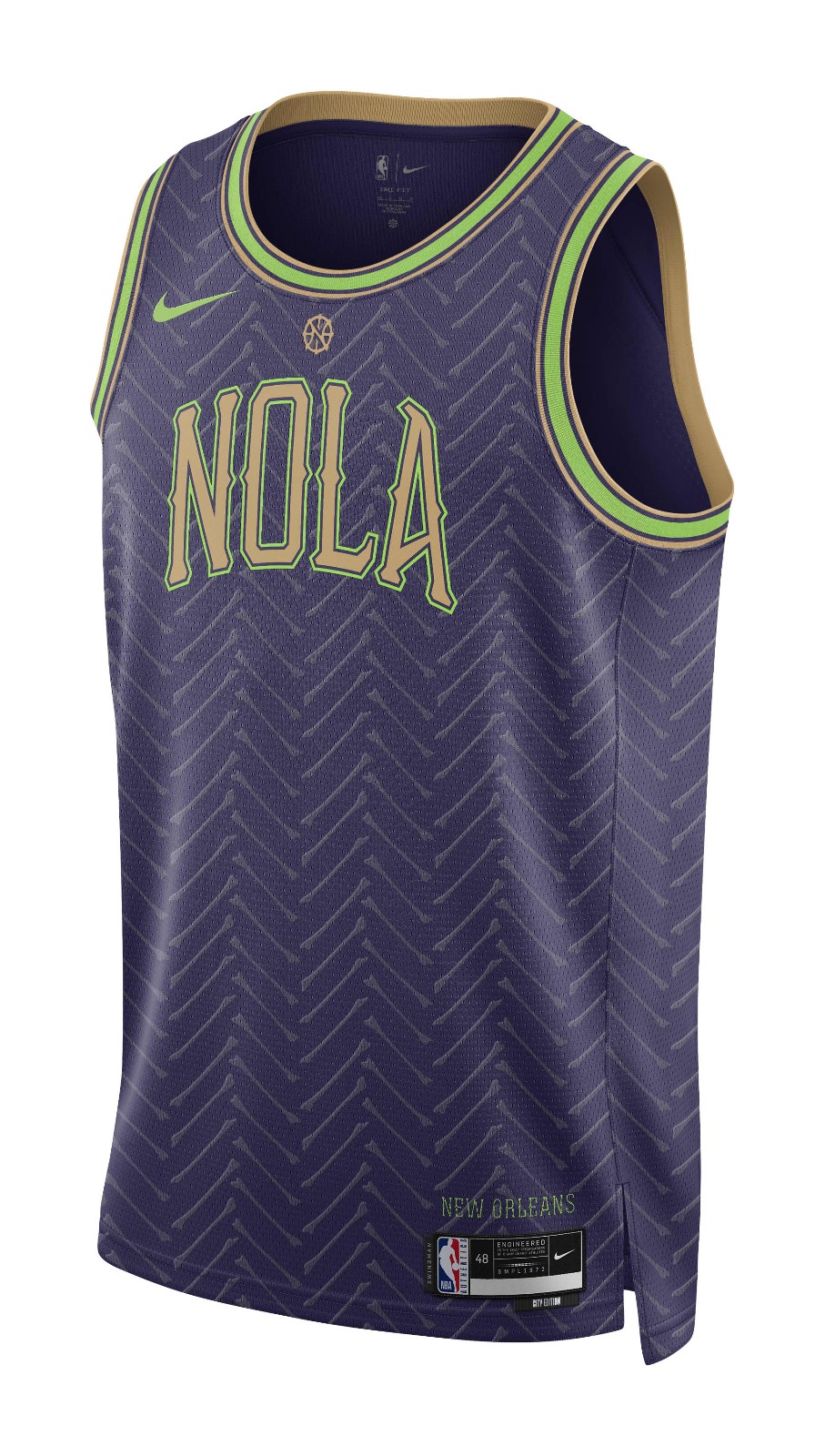
They took a chance with this one and it paid off. Not sure about neon accents, but love the creativity and detail in these Pelicans jerseys.
B-Tier
Charlotte Hornets
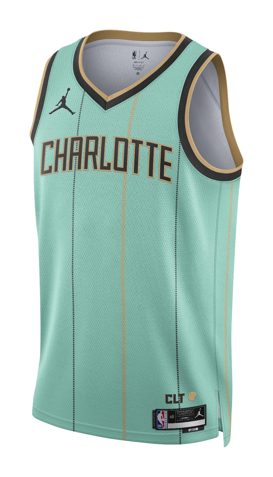
Colorful, fresh, exciting. These Hornets jerseys are what a City Edition jersey should try to be. Love the stripes. Don’t love the color or the font.
Golden State Warriors
Solid. Unique font and a great color combination. The yellow around the neck and arms pops.
Phoenix Suns
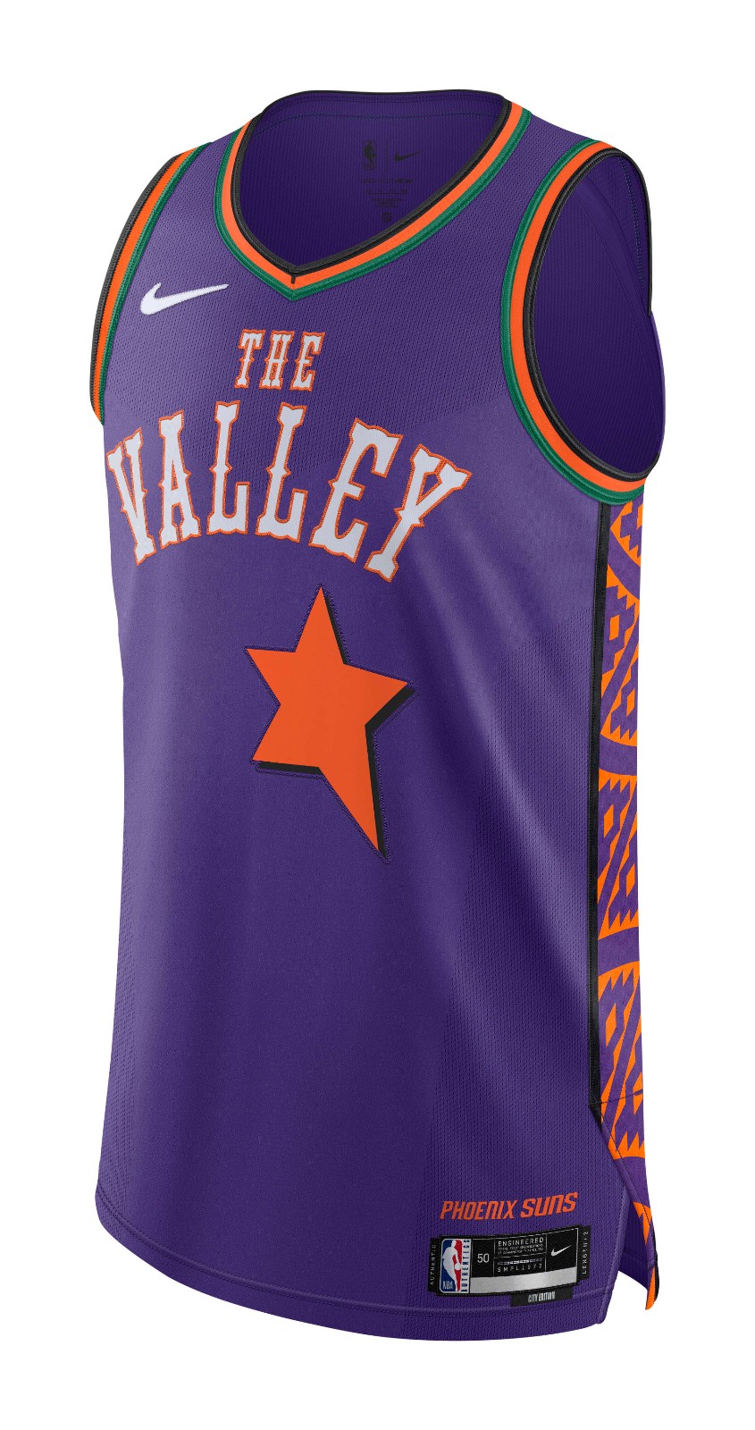
Lots of fun stuff going on here. The purple and orange are always strong, and the green accents work for me. Probably the best attempt at a side panel. A lot going on, but nothing too egregious.
C-Tier
Brooklyn Nets
Not terrible. Not great either. Might be time for the Nets to move on from the Basquiat Era.
Chicago Bulls
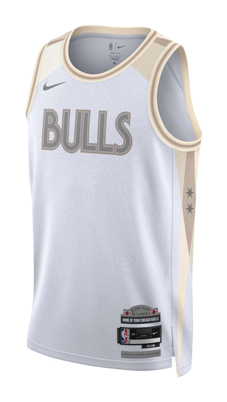
I can appreciate an attempt at a simple, minimalist design. They just missed the mark with this one. The colors are much too dull and muted. Nothing exciting and nothing that honors the city.
Los Angeles Clippers
Great design. Just too blue. Hopefully, the numbers have some white in them. I like the “Clips” and I love the basketball dotting the eye. Just a bit abrasive.
Memphis Grizzlies
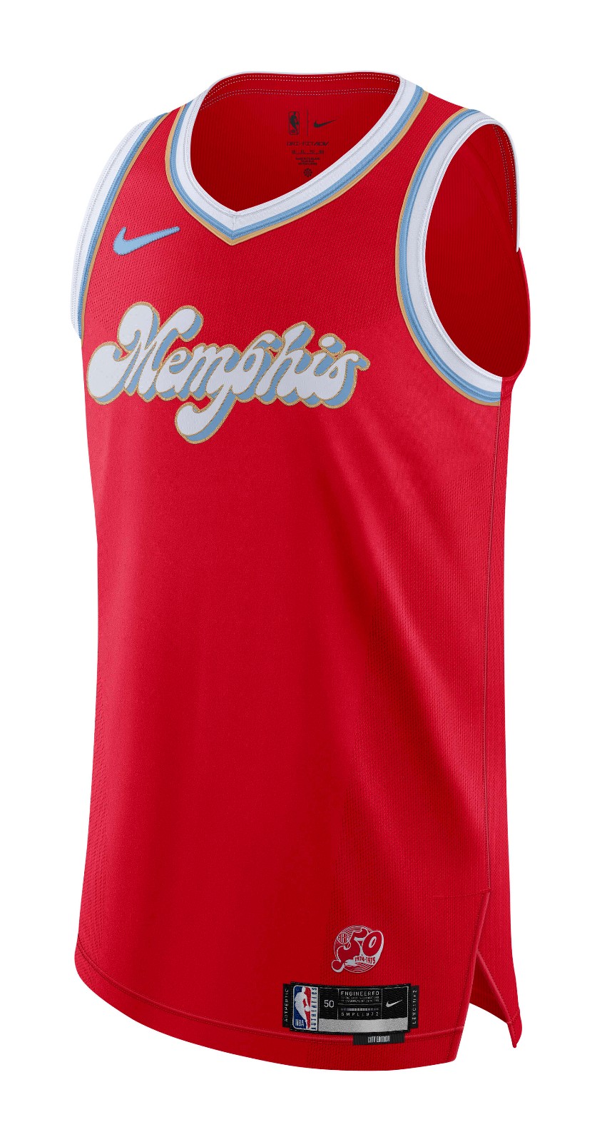
Just don’t love the shade of red. Sweet font. I can just imagine these being an eyesore on the court.
Oklahoma City Thunder
Interesting take on a Black Out uniform. Don’t love the side panel, but overall a fine-looking jersey.
Philadephia 76ers
These are okay. The Sixers have had great alternates in past years, and this just doesn’t quite stack up with those.
Portland Trail Blazers
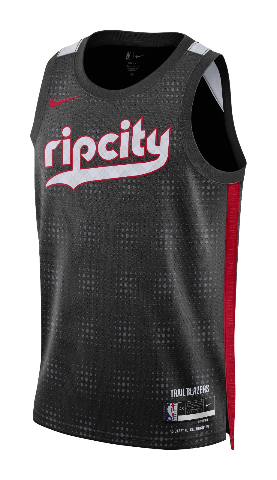
Looks like an AAU team. Not impressed.
San Antonio Spurs
I could see these growing on me, but right now I’m not so sure.
D-Tier
Cleveland Cavaliers
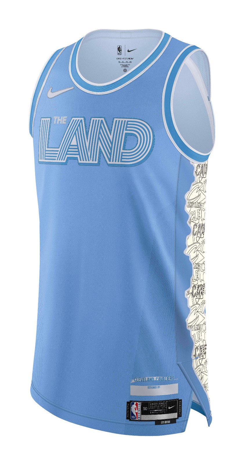
Yikes. Just trying to do too much. The Land? I don’t know. I really don’t.
Denver Nuggets
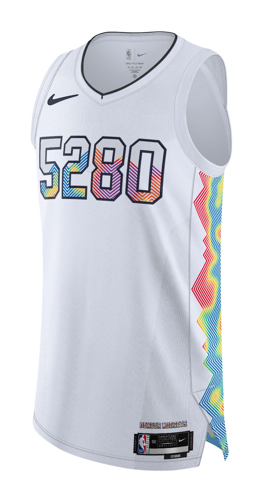
Another disappointing alternative from the Nuggets. With some of the best throwbacks in the history of sports, there is so much potential. But instead, they go all topographical on us. Boring and ugly. Should have followed Toronto and Utah and played the hits.
Minnesota Timberwolves
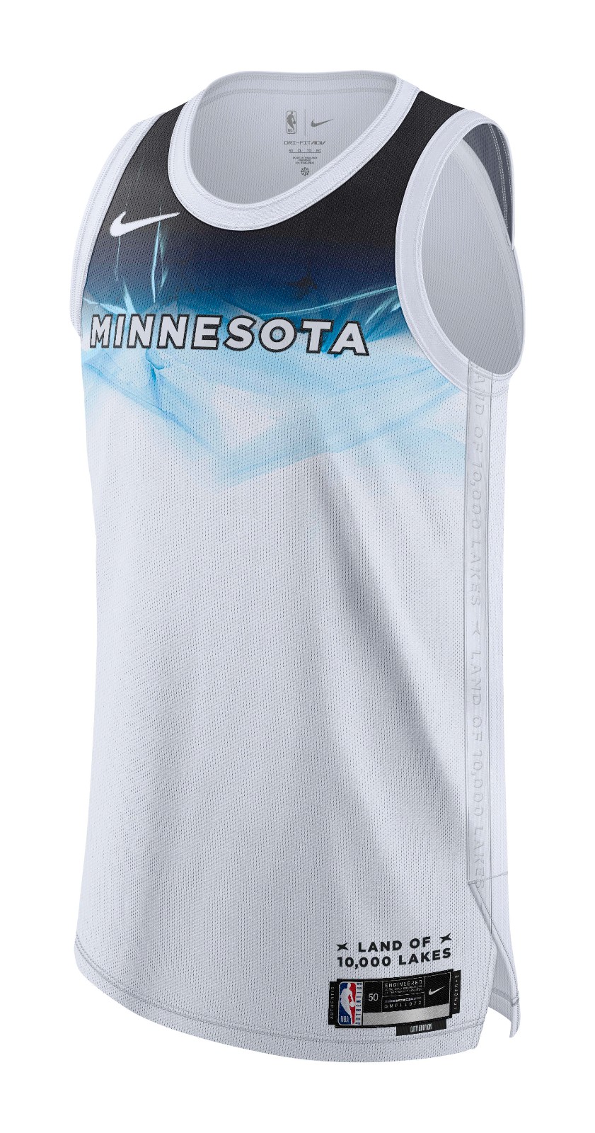
Confusing and ugly. No thank you.
New York Knicks
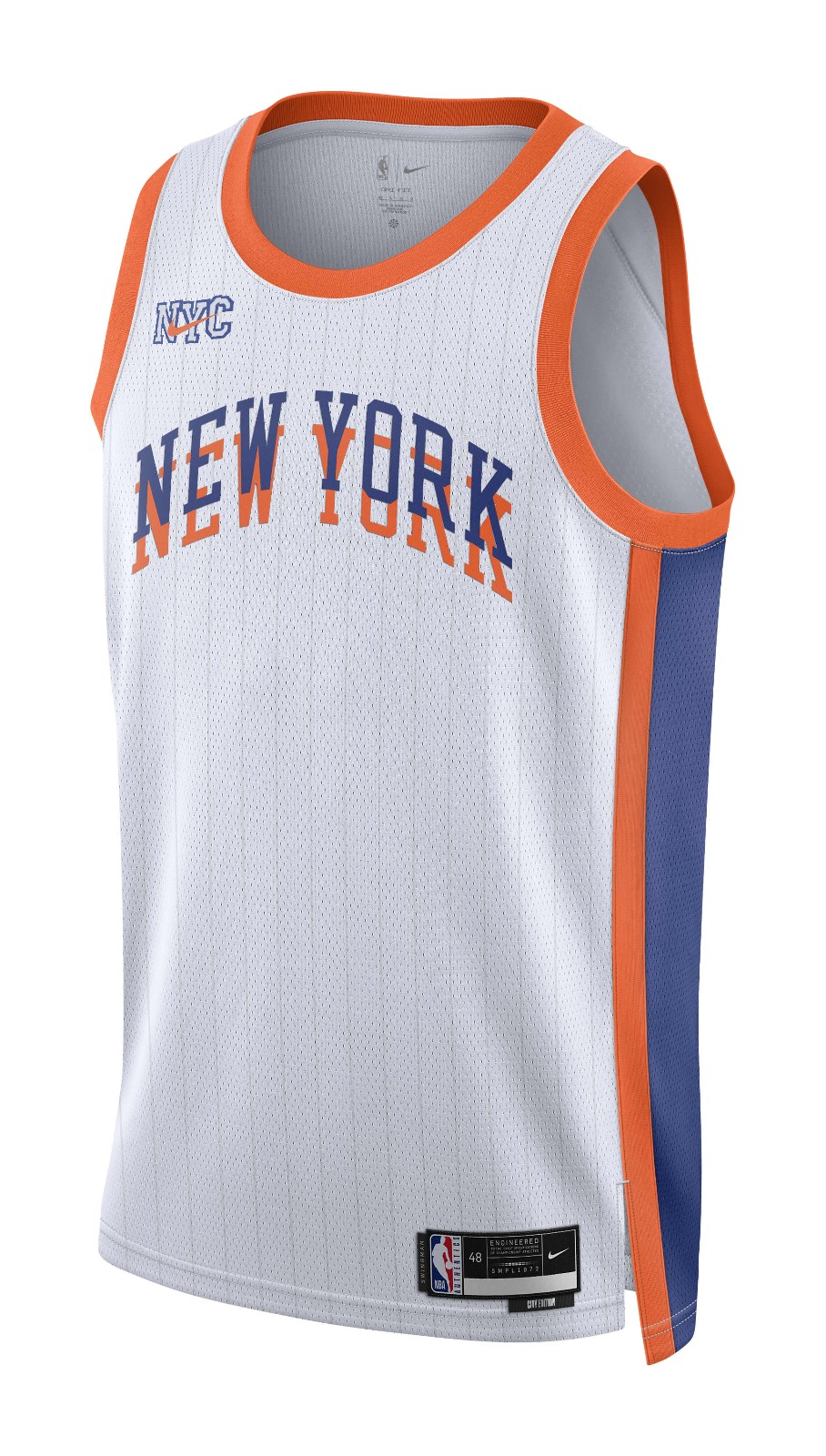
Have Knicks fans not suffered enough?
Washington Wizards
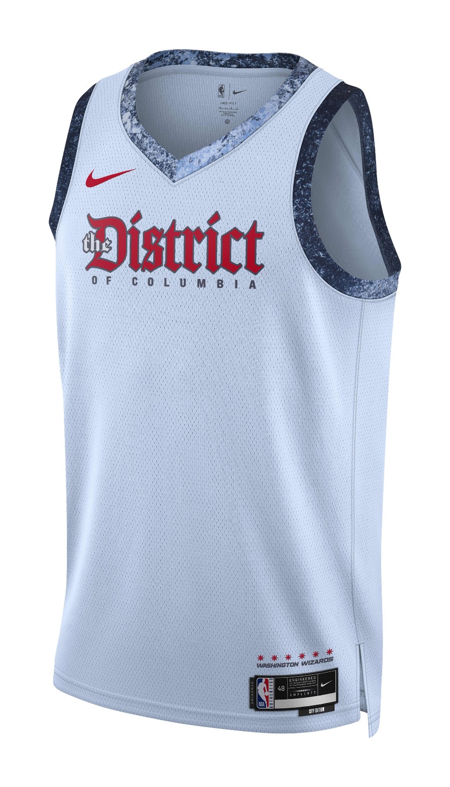
Ugly look for what should be an ugly squad this season.
F-Tier
Boston Celtics
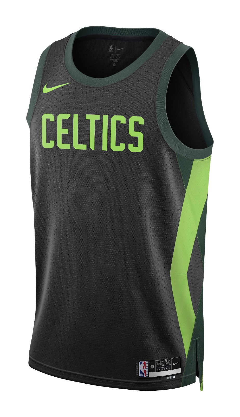
Just awful. Disgraceful even. Despite the obvious potential, the Celtics have yet to hit on a City Edition jersey. Spare us the alternates and keep it classic. Please.
Indiana Pacers
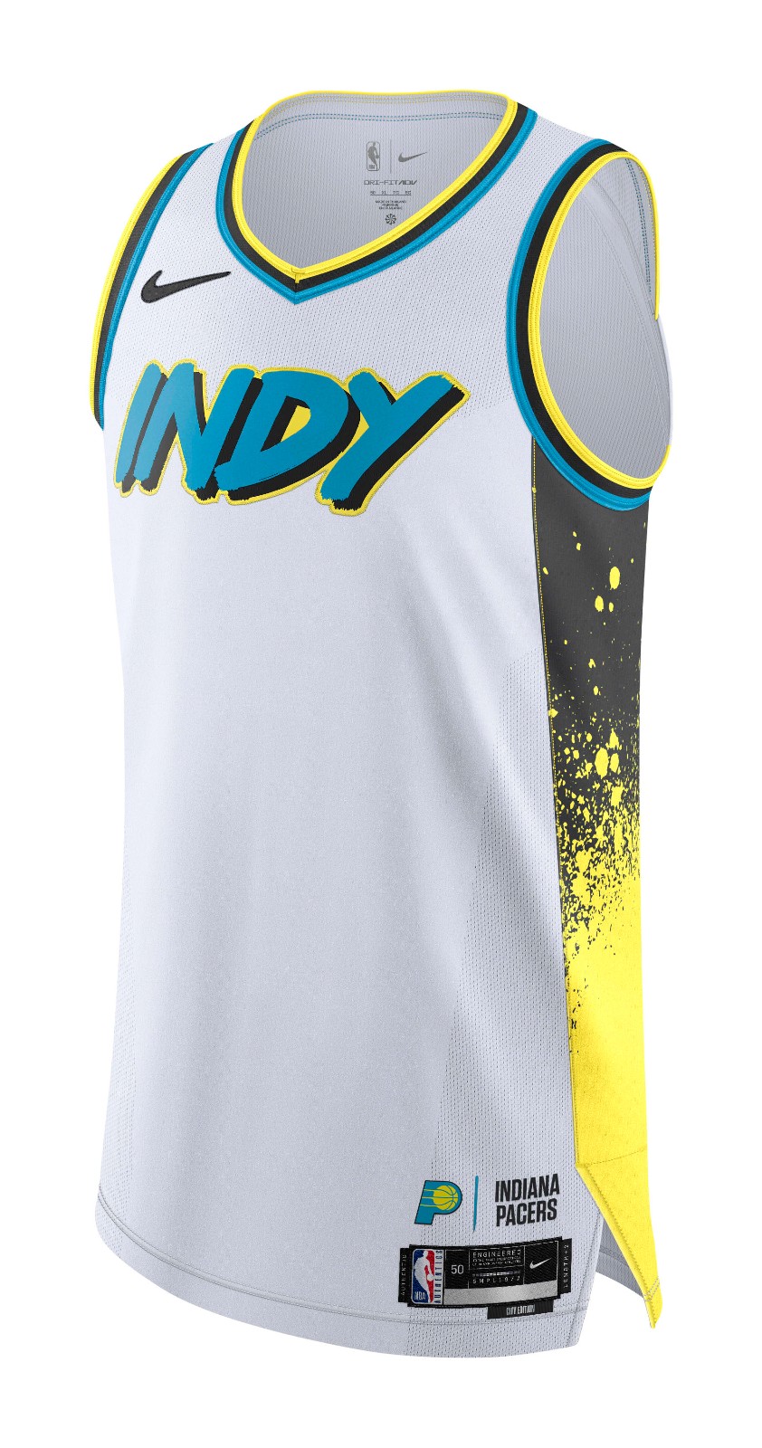
Not sure where to start with these. Highlighter? Teal? Font? YUCK.
Los Angeles Lakers
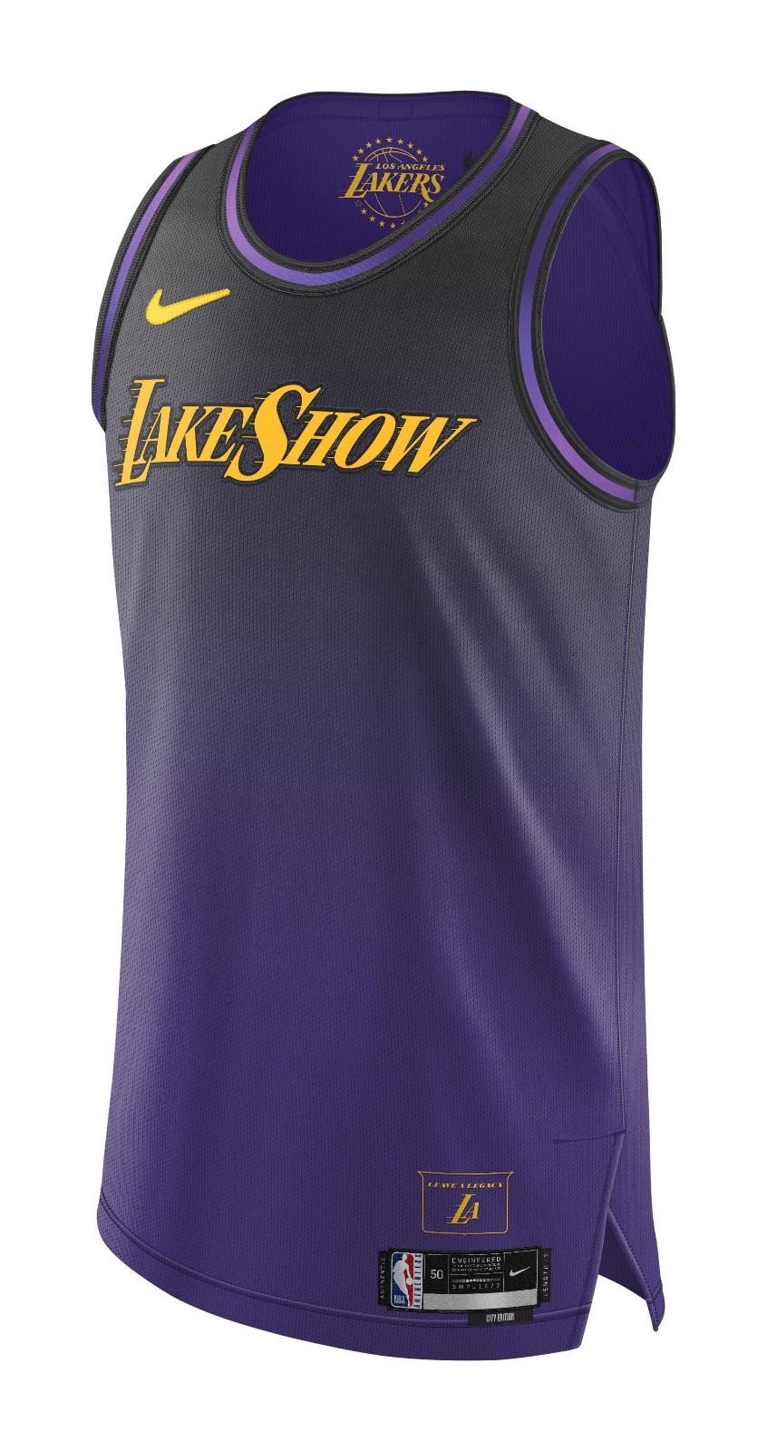
Same as the Celtics. The Lakers’ uniforms are sacred. Leave them alone. Gradient? LakeShow? No.
Miami Heat
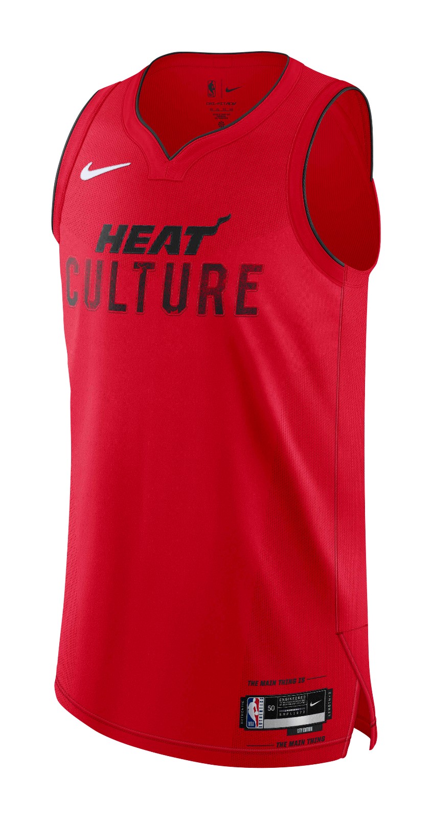
We have to stop with the “Heat Culture” thing. Really.

Leave a comment