
As the Washington Wizards’ long and unsuccessful 2025-26 season neared its curtain call, the franchise gave fans something to celebrate.
With spring in full bloom, Washington announced the return of its iconic cherry blossom jerseys for next season. Originally introduced in the 2022-23 season, the City Edition jerseys received strong feedback and quickly became one of the franchise’s most popular designs.
The vibrant pink threads pay tribute to the cherry blossom trees surrounding the famed Tidal Basin, offering a refreshing departure from the Wizards’ traditional red, white, and blue color palette.
In today’s sports culture, fans expect their team to stand out not just in performance but also in aesthetics. These threads accomplish exactly that. Their hot-pink base and floral accents bring some personality to a franchise that has leaned toward playing it safe.
Over Washington’s 65-year history, they’ve experimented with many jerseys to meet those expectations. Some hit, but some flopped. Here is the great, the good, the bad, and the ugly.
Great: 2023-24 City Edition
The 2023-24 City Edition jerseys combined visual appeal with deeply rooted meaning.
In 1790, George Washington signed the Residence Act, which moved the nation’s capital from Philadelphia to land along the Potomac River, now known as Washington, D.C.
A year later, mathematician Benjamin Banneker and a team of surveyors began marking the district’s original boundaries with 40 stone markers. The jersey’s red trim along the front and back forms the diamond shape that Banneker and company lined.
The copper and teal accent colors symbolize both the metal fencing that protects the stones today and the natural surroundings that surround them. Across the chest, “the District of Columbia” is written in Old English Blackletter font to mirror the typography often used in many 19th-century maps.
Aside from the history ingrained in the design, the jersey already looks great. The charcoal-black base paired with the vibrant lettering creates a sleek look. The vintage font is a clever symbol of the era that the jersey represents, and the gradient color scheme along the sleeves adds another layer of depth.
Given Washington’s adherence to its core colors for much of its history, this ambitious departure works perfectly.
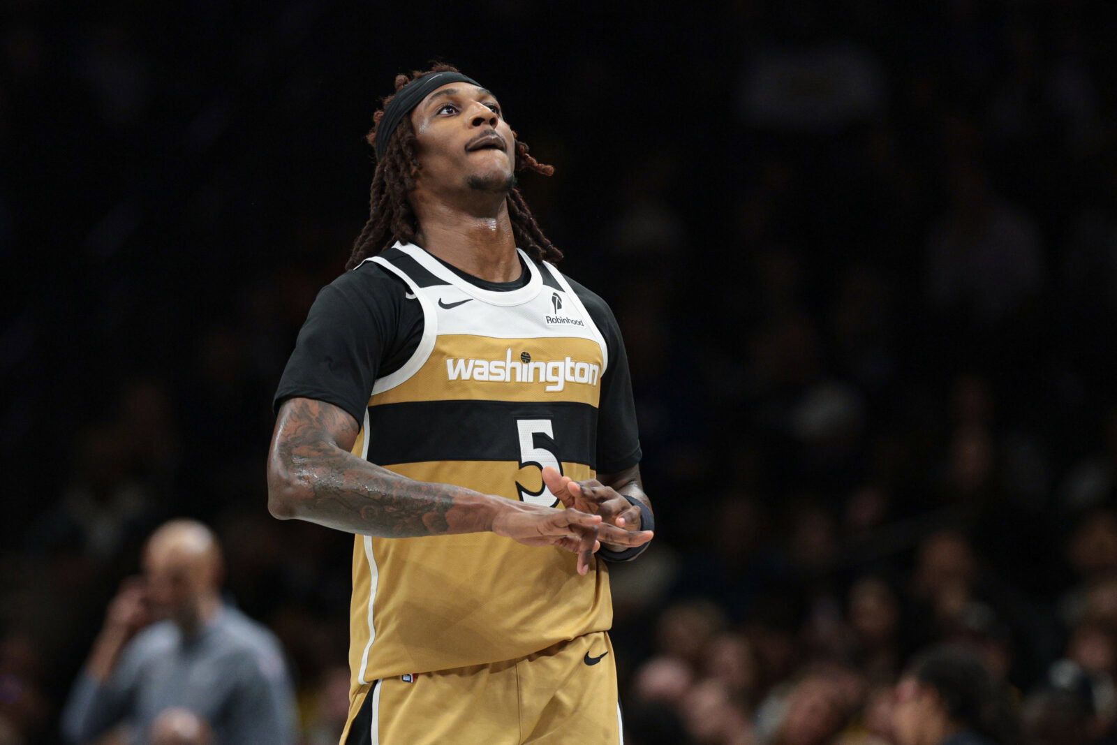
Good: 2025-26 City Edition
This season’s City Edition merged multiple eras of Wizards basketball into one beautiful design.
The uniform combines Washington’s alternate gold jerseys from the mid-2000’s and their striped Washington Bullets jerseys from the 1980s.
Blending the former’s colors and the latter’s layout, Washington created a design that feels both modern and nostalgic. The black accents on the original gold jerseys from decades ago were not as dominant. In the 2026 adaptation, the black is prominent as the center stripe, providing stronger visual contrast.
The jersey also sprinkles in small but impactful details. It features a newly introduced font on the jersey number and two additional logos on the shorts.
Along the waistline is a small emblem featuring the Washington Monument. At the bottom is the Wizards’ DMV logo, paying homage to the surrounding states of Maryland and Virginia. The cherry on top of these jerseys is the perfect City Edition court that ties it all together.
Overall, these threads celebrate multiple chapters of Wizards’ history while still feeling fresh.
Bad: 1987-1997 Away
The Bullets’ jerseys of the 1980s and 1990s were never something to write home about. Looking at them, there is nothing especially bad about them, but nothing stands out either. That’s the problem.
For an era known for bold, imaginative uniforms, these are surprisingly lifeless. Besides the basic blue-and-white stripes along the sleeves, there is no detail or creativity. The rest of the uniform remains barren, with just the name and number at the center.
In fairness, this jersey did lay the groundwork for Wizards jerseys to come. The “L’s” in “Bullets” reaching for the basketball above created a blueprint that Washington still follows today. Today, the ball dots the “I” in “Washington” and “Wizards” for their Icon and Association jerseys.
Regardless, influence alone can’t save this design. There is no pop or flare, marking this as another forgettable Wizards jersey.
Ugly: 2015-2017 Baltimore Pride
The Baltimore Pride jerseys, worn from 2015-16 through 2016-17, were the Wizards’ first alternate jerseys since 2009. This edition is a throwback to the Baltimore Bullets jerseys of the early 1970s, featuring a full-uniform stripe while staying modern and abandoning the original orange and blue.
Throwback can be fun, but some things are best left in the past. The design feels extremely barebones. Aside from the oversized stripe, the jersey lacks detail and creativity. The stripe was unique, but it looked distracting and out of place on the court.
The uniform perfectly captured two unfortunate trends of the mid-2010s: sleeved jerseys and the replacement of team names with logos. The NBA had a weird obsession with these two concepts. Neither of them looked natural, and the league’s decision to leave both trends in the rear-view was harsh but necessary.
The Bullets were pretty successful in these jerseys decades ago. But the Wizards couldn’t recreate the old magic, finishing 41-41 in the 2015-16 season and missing the playoffs.
All in all, these jerseys are unmemorable, basic, and not easy on the eye. They’d have been better off keeping these in the closet.


Leave a comment